Getting ready
Task 1
Create an R project for solving this Exercise Sheet.
Task 2
Download the csv-file SSRC_data.csv and the R script SSRC_C4_template.R and put it in the R project folder you created in Task 1.
Task 3
Open the SSRC_C4_template.R R Script.
Task 4
Load the tidyverse package.
# Load tidyverse package
library("tidyverse")
Task 5
Use the read.csv() command to load the SSRC data into R and call the respective data object SSRC_data.
# Load the dataset
SSRC_data <- read.csv("SSRC_data.csv")
Task 6
Get a first impression of the dataset by checking out the dataset using the str() command.
# Check out the dataset
str(SSRC_data)
'data.frame': 1000 obs. of 5 variables:
$ age : int 64 59 39 30 49 37 33 44 27 55 ...
$ gender : chr "male" "female" "female" "female" ...
$ education_level : chr "medium" "low" "high" "high" ...
$ physical_activity_level: chr "low" "medium" "low" "low" ...
$ bmi : num 27.9 27.5 27.4 24.2 23.9 30.7 25.1 30.3 18.5 30.2 ...Task 7
Transform the three character variables in the dataset into factor variables. Make sure that the levels of the physical_activity_level and education_level variables are ordered in a reasonable way. (You learned how to do that in chapter 3)
# Transform into factor variables
SSRC_data <- mutate(SSRC_data, gender = as.factor(gender),
                               education_level = as.factor(education_level),
                               physical_activity_level = as.factor(physical_activity_level))

# Order education_level and physical_activity_level in a reasonable way
SSRC_data <- SSRC_data %>%
              mutate(education_level = fct_relevel(education_level, c("low", "medium", "high"))) %>%
              mutate(physical_activity_level = fct_relevel(physical_activity_level, c("low", "medium", "high")))

# Check whether it worked out
levels(SSRC_data$education_level)
[1] "low" "medium" "high" levels(SSRC_data$physical_activity_level)[1] "low" "medium" "high" Task 8
What kind of plot would be useful to analyze the …
- the variation of gender?
- the variation of bmi?
- the covariation of physical_activity and education_level?
- the covariation of bmi and physical_activity_level?
- the covariation of age and bmi?
# variation of gender -> Bar Chart

# Variation of bmi -> Histogram

# Covariation of physical_activity_level and education_level -> Heat Map

# Covariation of bmi and physical_activity_level -> Boxplot

# Covariation of age and bmi -> Scatterplot
Bar Charts
Task 9
Use a bar chart to analyze the distribution of the physical_activity_level variable.
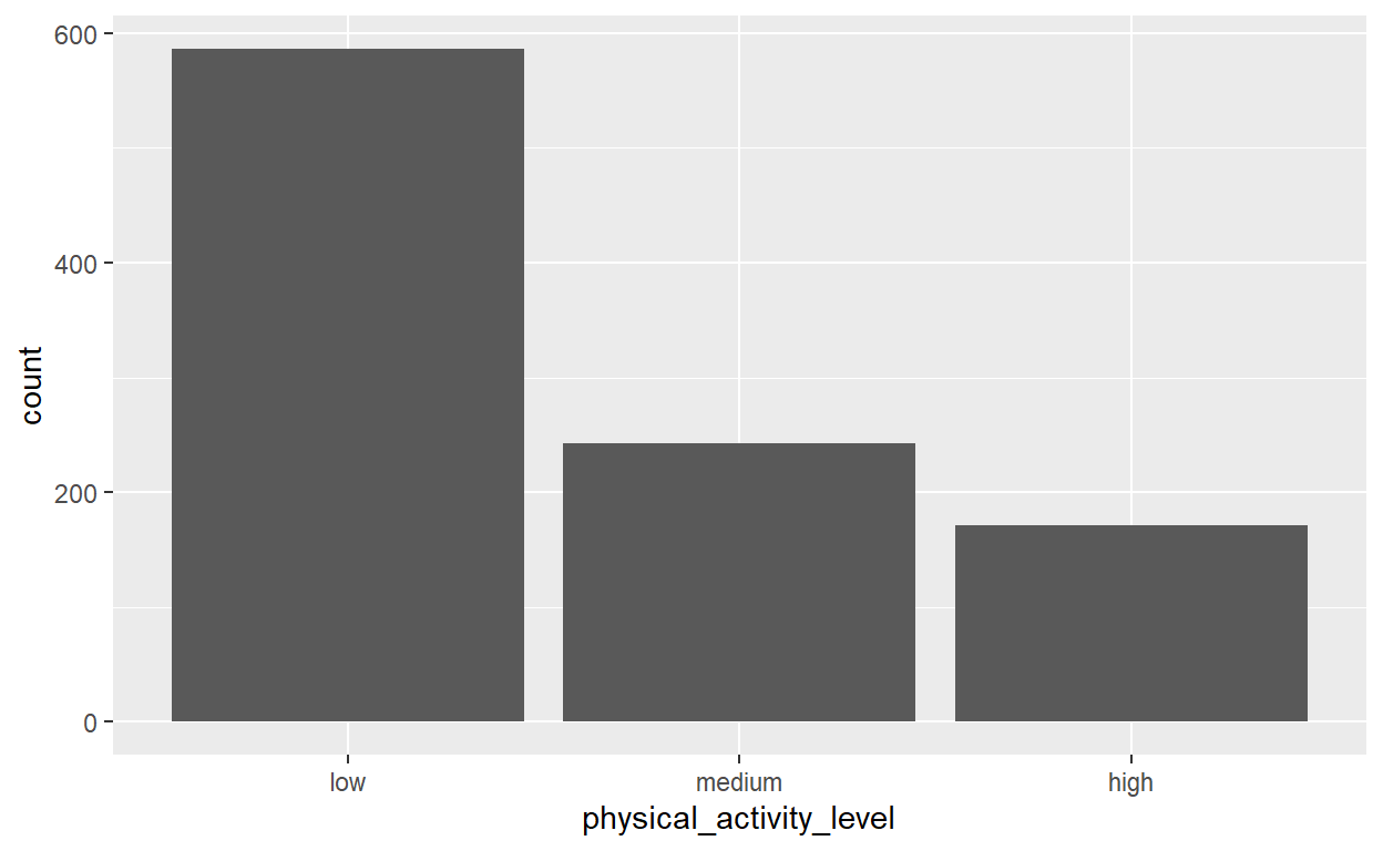
An alternative to putting the mapping argument in geom_bar() command is to put it in the ggplot() command in the first line:
# Create bar chart
ggplot(data = SSRC_data, mapping = aes(x = physical_activity_level)) +
  geom_bar()
Both alternatives work, but the later one is probably the approach that is more commonly used. Hence, we will also use the second approach whenever we create plots in the SSRC sample solutions.
Task 10
Create the same bar chart as in Task 9 but with colored bars and a decreased bar-width of 0.5.
# Create bar chart
ggplot(data = SSRC_data, mapping = aes(x = physical_activity_level, fill = physical_activity_level)) +
  geom_bar( width = 0.5)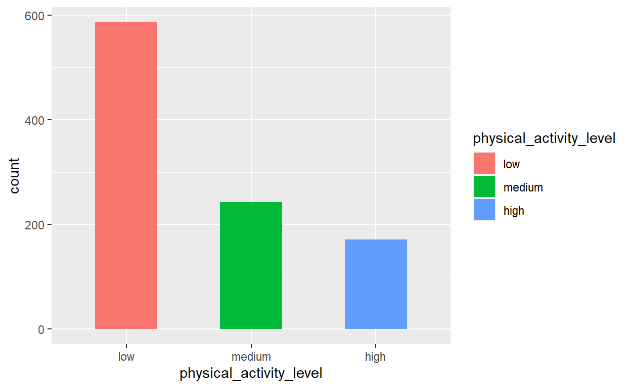
Histograms
Task 11
Create a histogram to analyze the distribution of the variable age.
# Create histogram
ggplot(data = SSRC_data, mapping = aes(x = age)) +
  geom_histogram()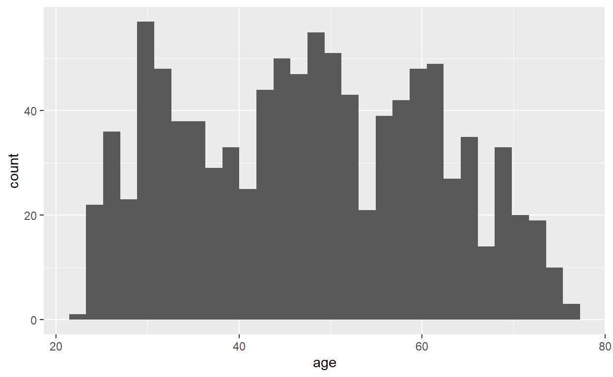
Task 12
Create the same histogram as in Task 11 but change the binwidth to 1.
# Create histogram
ggplot(data = SSRC_data, mapping = aes(x = age)) +
  geom_histogram( binwidth = 1)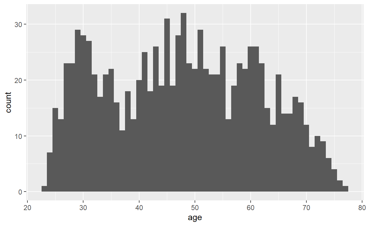
Density Plots
Task 13
Create a density plot to analyze the distribution of the variable bmi.
# Create density plot
ggplot(data = SSRC_data, mapping = aes(x = bmi)) +
  geom_density()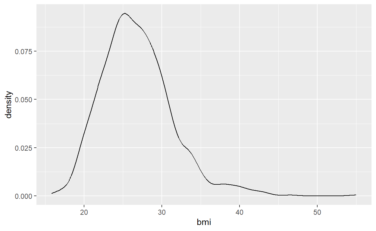
Task 14
Create a plot that depicts the distributions of bmi for males and females in a single plot.
# Create density plots
ggplot(data = SSRC_data, mapping = aes(x = bmi, col = gender)) +
  geom_density()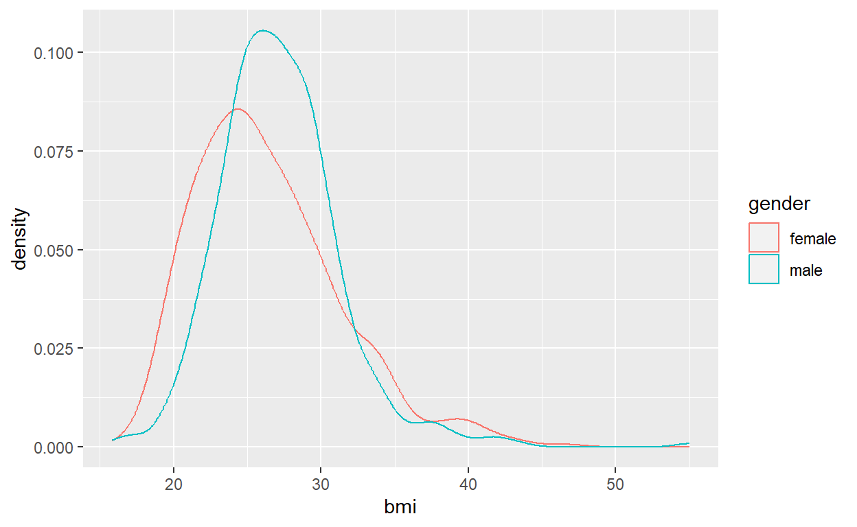
Boxplots
Task 15
Create a set of parallel boxplots to describe the relationship between education_level and bmi.
# Create boxplots
ggplot(data = SSRC_data, mapping = aes(x = education_level, y = bmi)) +
  geom_boxplot()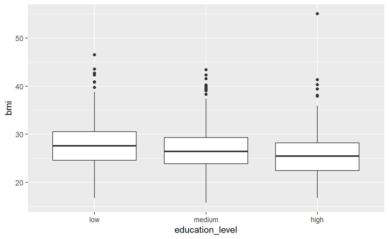
Scatterplots
Task 16
Create a scatterplot to analyze the relationship between age and bmi.
# Create Scatterplot
ggplot(data = SSRC_data, mapping = aes(x = age, y = bmi)) +
  geom_point()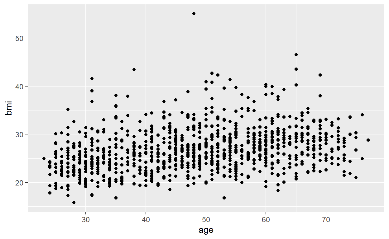
Task 17
Create the same scatterplot as in task 16 and add a line that approximates the relationship between age and bmi. (Use method = “lm”)
# Create Scatterplot with a smoother
ggplot(data = SSRC_data, mapping = aes(x = age, y = bmi)) +
  geom_point() +
  geom_smooth(method = "lm")
`geom_smooth()` using formula = 'y ~ x'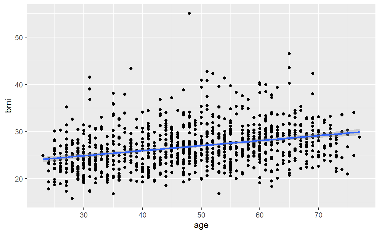
Task 18
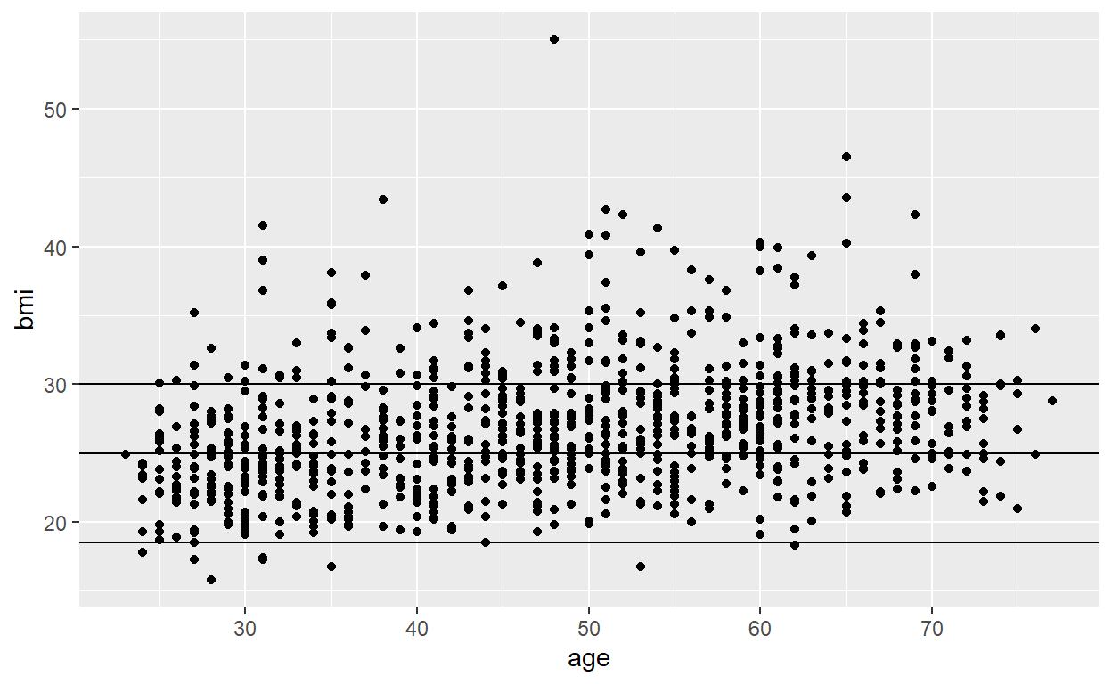
Create the same scatterplot as in task 17 and add three horizontal lines that indicate bmi levels of 18.5, 25 and 30.
# Create Scatterplot with horizontal lines
ggplot(data = SSRC_data, mapping = aes(x = age, y = bmi)) +
  geom_point() +
  geom_hline(yintercept = c(18.5, 25, 30))